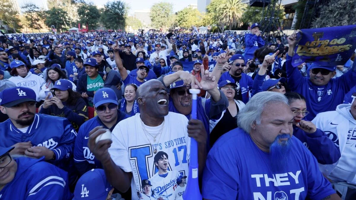
A Billion-Dollars worth of Dodgers Blue
Here's a thought experiment: if Dodgers hats were their own company, what would they be worth? Based on an estimated $210 million in sales and noting that New Era sells roughly 75 million caps annually—with the LA cap representing an estimated 6–8% of that total (with that number still climbing)—the LA fitted alone could be valued at $1 billion.
Think about that. One billion dollars derived from two interlocking letters that have become the unofficial flag of Los Angeles and California. That's nearly 20% of the team's total valuation, generated not from performance metrics or player stats, but from a mnemonic cue—a visual signal so embedded in the emotional and cultural architecture of the city that it transcends baseball entirely.
This is where sport crosses into neuroscience. The "LA" is not just typography—it's a mnemonic symbol. It triggers emotional recall, nostalgia, belonging, and civic identity in milliseconds. Fans don't simply see blue and white—they live it. That's the real billion-dollar business: emotional equity born from sensory exposure and deeply rooted cultural identity.

Memory, Identity, and the Culture of Caps
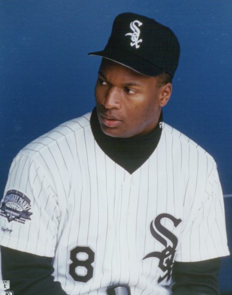
The first baseball hat I remember wanting was the Chicago White Sox. Why? Frank Thomas and Bo Jackson, of course. Then the Orioles—Cal Ripken. And then insert Spike Lee. A deep Yankees fan, the legend goes Spike asked New Era for a Yankee fitted in red. They obliged, and the rest is history: hip-hop, culture, fashion, Ken Griffey Jr.'s backwards cap, and championships colliding to redefine an industry.
By the mid-90s, fitted caps had become mnemonic extensions of identity—wearable memory systems. Every logo was a cue; every color, a signal in the emotional circuitry of pride and aspiration. Fans didn't just wear teams; they wore the moments, the cities, and players that captured them. Caps became the quintessential way to pledge your allegiance and share your style. It may be underestimated how deeply a team's identity and logo play into both brand value and championship fortitude.
Sports psychologists call this emotional conditioning—when repeated exposure to color, sound, and symbol creates a reflexive attachment. Children who first see their team's logo before age eight develop long-term brand loyalty that's easily observable in real-time in stadiums and social media platforms. The earlier the sensory imprint, the harder the allegiance shifts. That's why early sensory exposure is everything—it's neurological real estate driven by nature and design strategy.

The Yankees logo itself has pedigree. MLB notes that Louis Tiffany & Co. created the interlocking NY insignia, which first appeared on the Medal of Valor awarded by the NYPD in 1877. The Yankees adopted it in 1909—a logo steeped in luxury that only New York could provide. The beauty of the design, rooted in valor and luxury, proved to represent the grit and heart of the city. This unique association with the designer of the World Series trophies, through acts of valor, helps explain why the Yankees lead the league in championships. But another contender has arisen—one whose roots took hold in Brooklyn.
So when fans recall the first time they saw Dodgers Blue under the California sun, or Spike saw the Yankees for the first time—those moments are not just memories; they're identity formation imprints.

West Coast, Best Coast: The Rise of LA
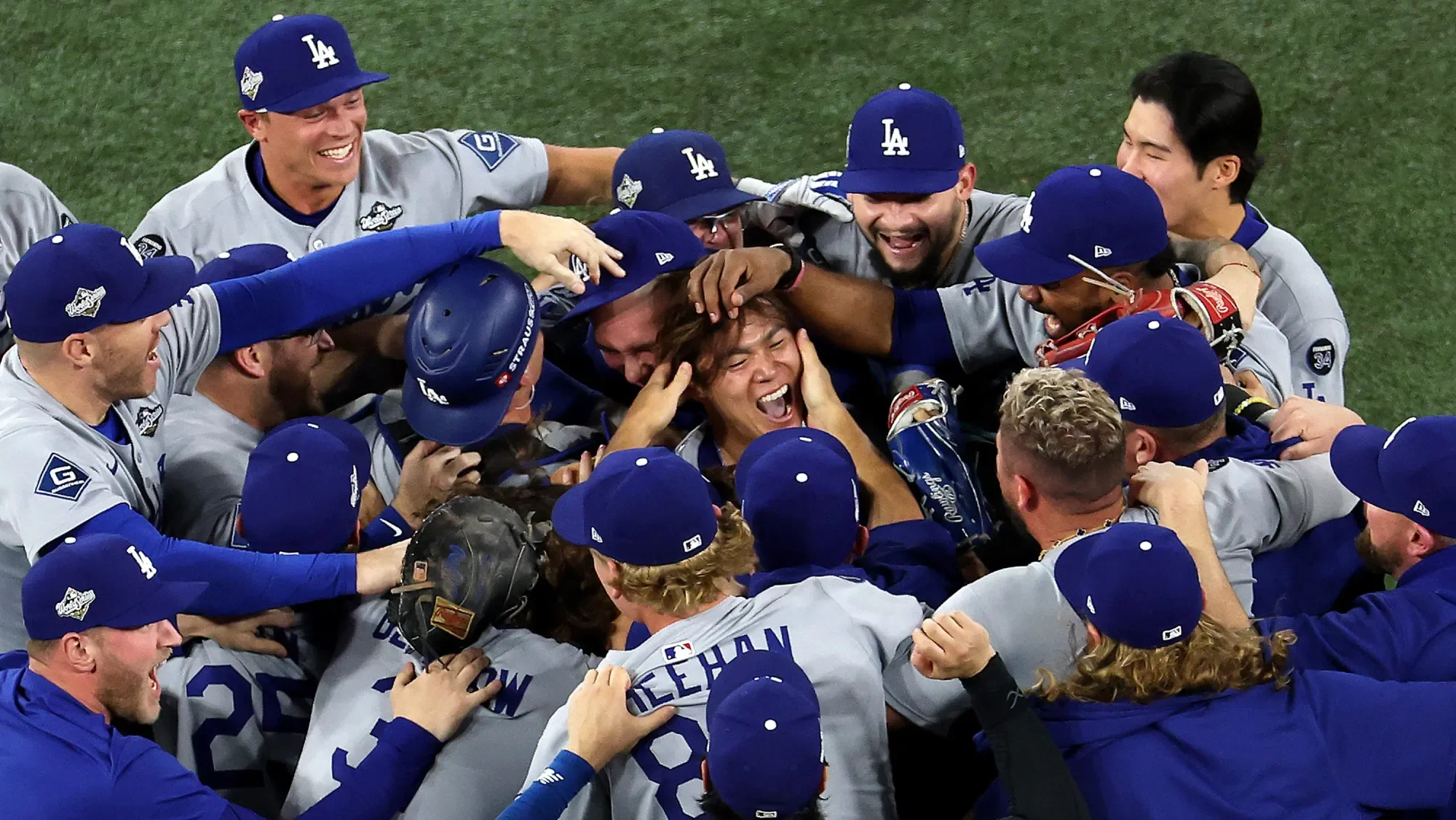
The Dodgers, back-to-back champions and the biggest force in baseball as we know it right now (Game 7 viewership broke a 30+ year record), have LA squabbling up for its squad. As LA's culture expanded from studios to streets, its symbols became shorthand for global cool. Rappers, athletes, and directors wore Dodger Blue as both civic armor and creative statement. A staple in music videos and award shows, fitted hats became crowns of culture.
And while the Yankees' iconic brand is threaded to history from the luxury company Tiffany & Co., the Dodgers are approaching the apex of global cultural saturation. The "interlocking LA" logo became a habit reinforcement mechanism—connected to beaches, icons, cities, players, international stars, and champions. Every repetition strengthened the brain's associative link between LA, aspiration, and authenticity.
This is how color and repetition reinforce identity: habit reinforcement through daily exposure. Each hat, billboard, and broadcast becomes a microdose of city pride. Over decades, it's not just marketing—it's myelination, the physical hardwiring of loyalty into the brain.
Getty Images
The Mystery of the Interlocking LA
I'm fascinated by design, culture, and style. And this is probably one of my favorite stories in sports. Unlike the luxury origins of the Yankees' NY, the Dodgers' interlocking LA was born from manufacturing pragmatism and long-standing partnership. Though the storied equipment manufacturer was based in Boston, the story goes that "someone" in the Brooklyn office suggested the interlocking LA during the team's westward transition. But therein lies its genius: authentic origin, universal adaptability.
The simplicity of the design enabled infinite repetition across media, eras, and cultural genres. This adaptability is precisely what makes it the perfect mnemonic architecture—it scales, flexes, and remains emotionally intact.
It's the visual equivalent of a chord progression: instantly recognizable, emotionally reliable, infinitely remixable.
This story reveals the beauty of business partnerships—how a manufacturer helped seal the identity of the country's newest baseball dynasty decades before Game 7 of the World Series. The intimacy that manufacturers and designers have over the stewardship of their partners' brands has yielded fruit for generations.

Stewards of Memories
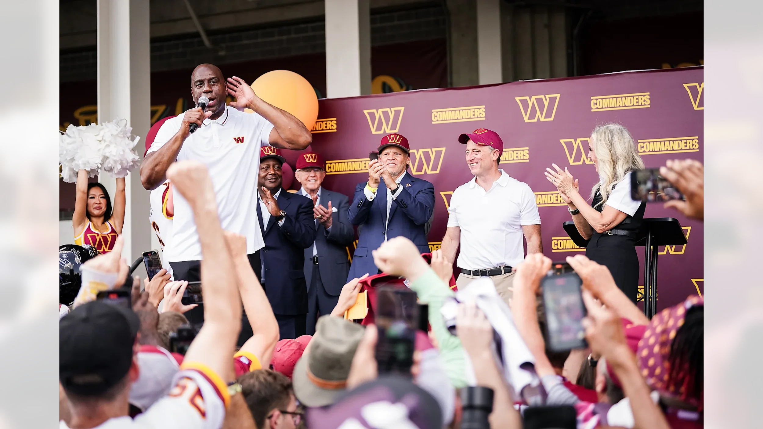
Josh Harris once noted that his ownership group are "stewards of memories." That line carries profound psychological weight. Because in truth, what fans remember—the logos, the colors, the chants—are the mnemonic cues that store emotional experiences. Every jersey, every scoreboard moment becomes a symbolic container for memory and meaning.
When a child wears a city's colors, they're not just watching a game; they're encoding identity. From that first Thanksgiving at their father's knee watching a burgundy and gold jersey flash across the screen, their brains are mapping belonging through these sensory experiences. The brightness of a jersey, the roar of a crowd, the feel of a cap's brim. These become the touchpoints that, decades later, make a fan tear up when they see that same logo. The ownership group that Harris and his team put together for the Washington Commanders all have these core memories that formed their love for the nation's team, DC's heart and soul.
That's the hidden business of culture: turning emotion into equity.
The Paradox of Less is More
The NFL's 17-game season demonstrates something fascinating about scarcity and mnemonic strength. Fewer games mean each exposure carries more weight. Each Sunday becomes a ritual, a reinforcement of identity through rarity and repetition. Fans crave consistency—and each viewing reactivates those emotional pathways.
So when we talk about the NFL's towering valuations, we're really talking about the neuroscience of anticipation—the conditioning power of scarcity. Less isn't just more; less is memorable.
LA: An Undervalued Empire
LA's market is an empire of mnemonic gold, purple, and blue. Its championship pedigree and entertainment synergy make its icons—from the Lakers' purple and gold to the Dodgers' blue and white—the most recognizable visual language in global sports.
Each color palette represents a psychological franchise of its own. These visual cues build emotional continuity across sports, music, and fashion, creating a cohesive civic narrative. The simplicity of baseball's iconography and civic identity fully encapsulated in two letters—may be underrated. LA's hats, jerseys, and logos aren't accessories—they're identity transmitters. What two-letter city will arise next to the stage of world sports?
The Unified Brand Thesis
For cities like New York, Los Angeles, Chicago, Philadelphia, Boston, Detroit, Denver, Miami, Dallas, Minneapolis-St. Paul, and San Francisco—cities that have all major professional sports teams—the sports saturation creates an identity challenge.
Imagine, then, a unified secondary mark—one that complements, not competes. A logo that functions as a mnemonic bridge: connecting teams, fans, and city identity through shared color harmonies and emotional recall for these cities.
Cities like New York and Los Angeles have monetized pride into permanence. And maybe it's time for cities to discover a single, powerful cue that threads authentic city culture through all the sports franchises.
Closing Reflection
In the end, logos aren't just design—they're memory infrastructure. They're the visual shorthand for who we are, where we're from, and what we belong to. And when those cues are repeated across generations, through hats, movie sets, and shared rituals, they evolve from marketing assets into cultural legacies.
Because a logo doesn't just represent a team.
It reminds us we were there—and that we are forever threaded to these moments that connect us all.